


20 Years of Federal Foster Care Spending, Plus FY23 State Comparisons
FY2003-FY2023

Child Welfare Wonk Analysis: States Shoulder Growing Foster Care Costs
We’ve long known states cover over half of all child welfare costs.1 But there’s always more to understand about how child welfare financing is working.
To that end, we reviewed twenty years of previously unpublished public Title IV-E spending data, to learn more for you.2
This analysis looks at foster care covered by Title IV-E of the Social Security Act. Before we dig in, here’s an important refresher on IV-E eligibility.
Title IV-E Eligibility: Our Title IV-E Deep Dive notes that federal funding only covers foster care when a child’s family earns less than the state’s old Aid to Families with Dependent Children (AFDC) limits, without inflation adjustment.
We’ve noted before that the “AFDC Lookback” is a core driver of the falling federal share of child welfare financing. Why?
Federal funding is open-ended but income limited. Inflation erodes the eligible population each year. States, tribes, and localities cover the rest.
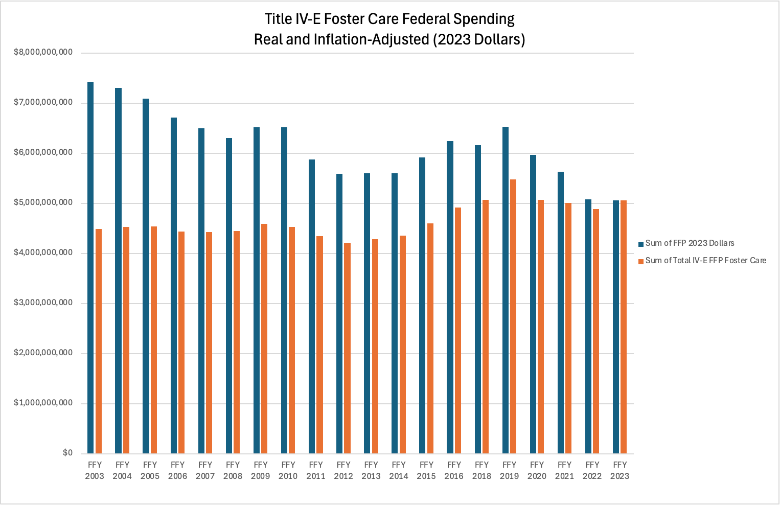
Inflation-Adjusted Federal Foster Care Spending Dropped Nearly 1/3 Since 2020
First up, this chart shows you twenty years3 of Title IV-E Foster Care Federal Financial Participation (FFP).4 It breaks it down into both real and inflation-adjusted terms.
You’ll note that while the total federal funding in real terms looks pretty stable for two decades, in 2023 dollars it was about a third higher in FY03.
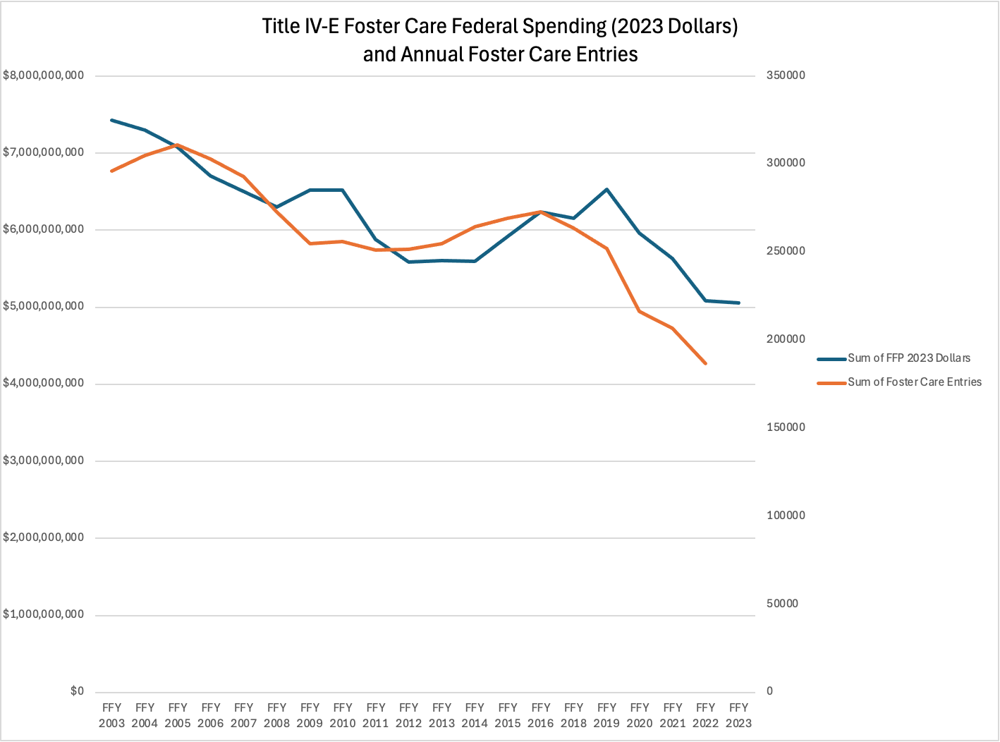
Fewer Kids Entering, Lower Spending…
This next chart shows the trends of both Title IV-E federal foster care spending in inflation-adjusted terms, and the annual number of kids entering care.
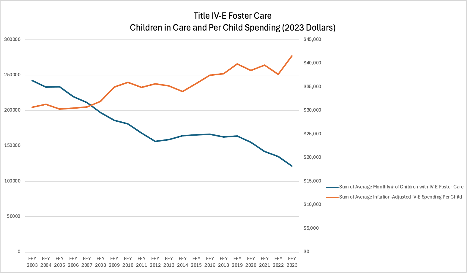
Total Federal Spending Dropped, But Per-Child Federal ROSE
Here’s where things get interesting. While entries and spending track, things change dramatically when you look at per-child federal spending.
While total federal spending is down, measured per-child it’s way up. That suggests that the eligible population is shrinking, and more of foster care is left to states.
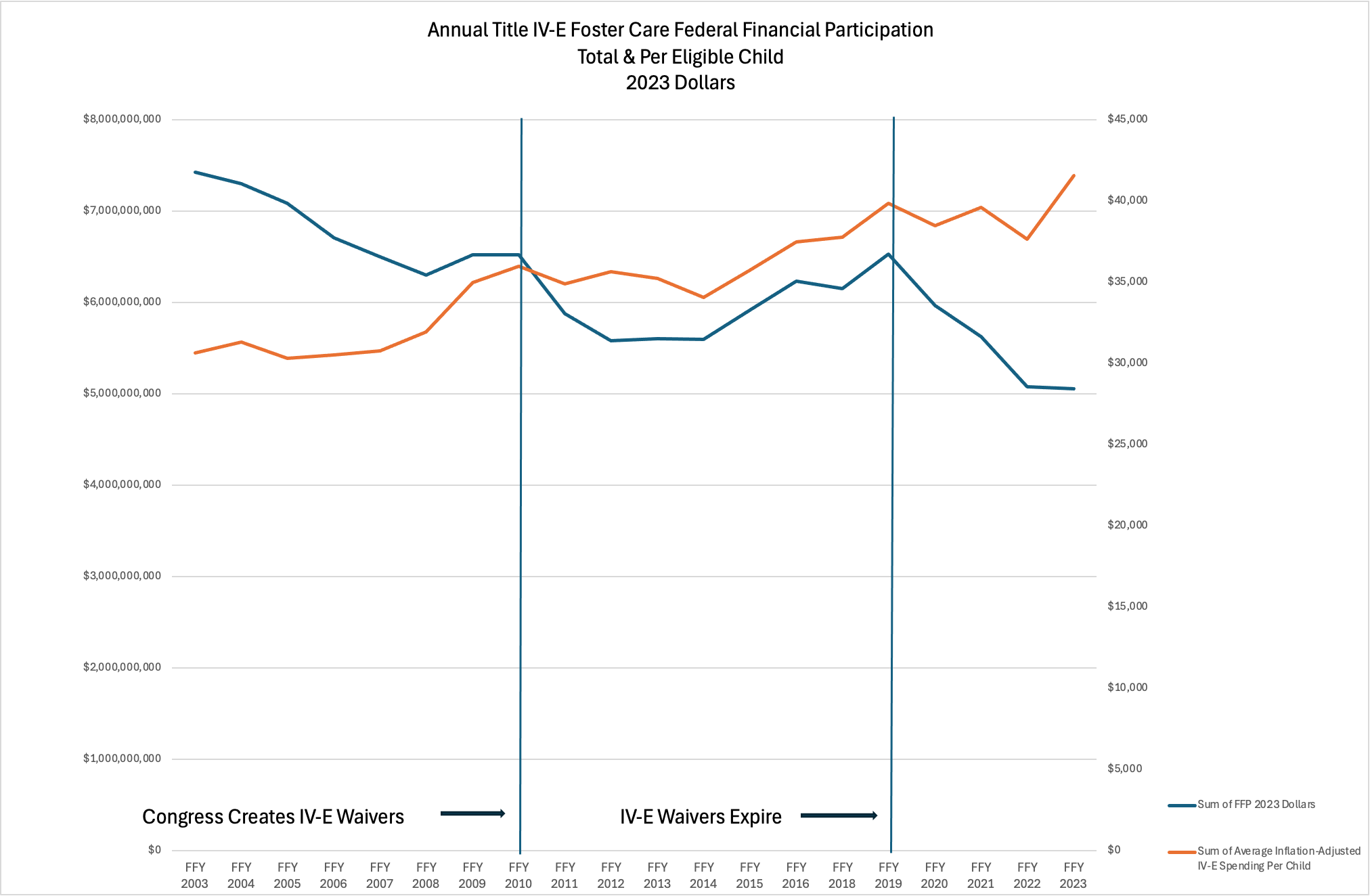
Did Waivers Delay the Trend?
The next chart shows how inflation-adjusted total federal foster care spending and per child spending trend over this period.
For about ten years they link up and move together. What’s happening there?
One hypothesis is the Child and Family Services Improvement and Innovation Act (P.L. 112-34).
It offered states waivers from Title IV-E rules. They experimented with prevention and other innovations, but also just did their usual work with way less eligibility math effort.
This suggests that may have made it possible to cover more children through the waivers, which sunsetted right around when the lines diverge.
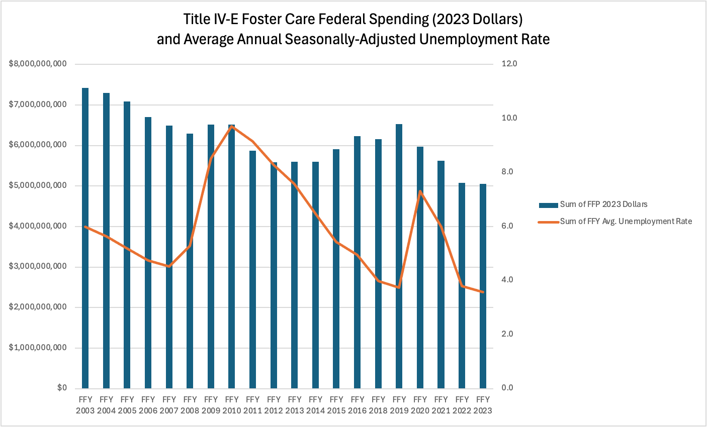
Unemployment and Federal Foster Care Spending
This last one looks at inflation-adjusted Title IV-E federal foster care spending and the average annual seasonally adjusted unemployment rate.5
There seems to be some general trending together when both decrease, but not a commensurate increase to accompany a jump in unemployment.
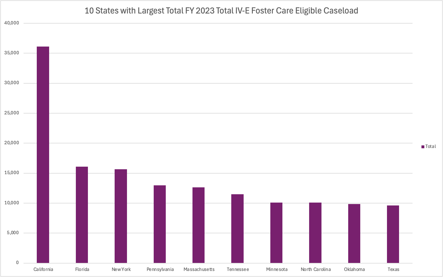
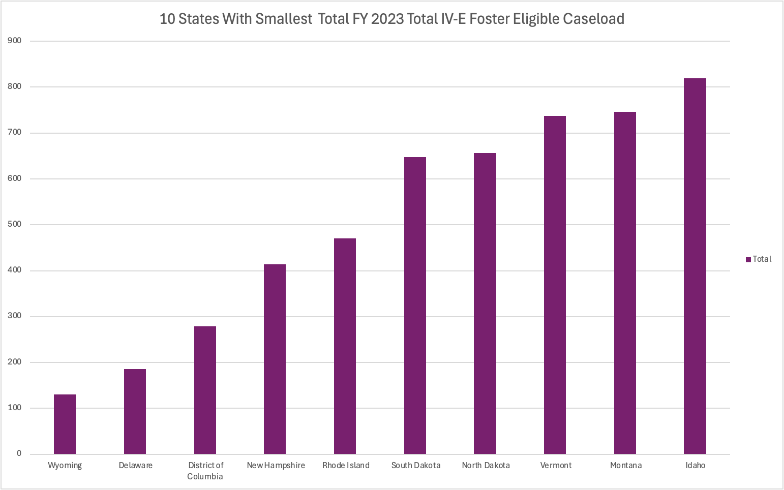
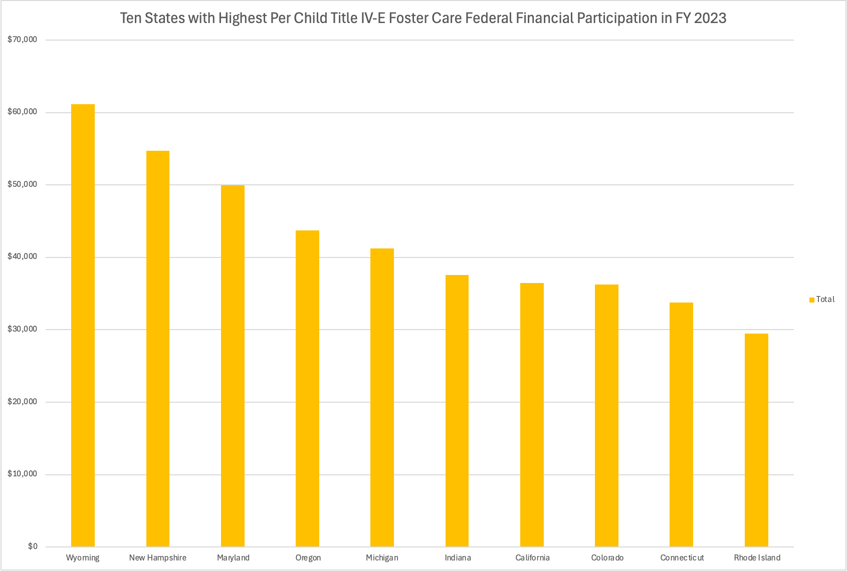
FY23 Analysis: State of The States
To bring it all home, we also have for you an analysis of state claims of federal Title IV-E foster care funding in FY2023, the most recent data.
Biggest and Smallest IV-E Eligible Foster Care Caseloads
These two show you the top 10 largest and smallest total annual caseloads of kids who were in foster care and eligible for IV-E.
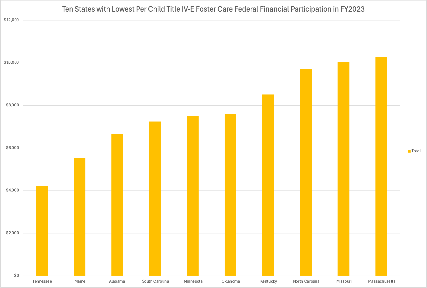
Per-Child Federal Spending
These show top 10 highest and smallest average per-child federal claims by state.
Why it Matters: States with lower reimbursement rates6 face investment tradeoffs between direct services and the administrative functions needed to maximize claims.
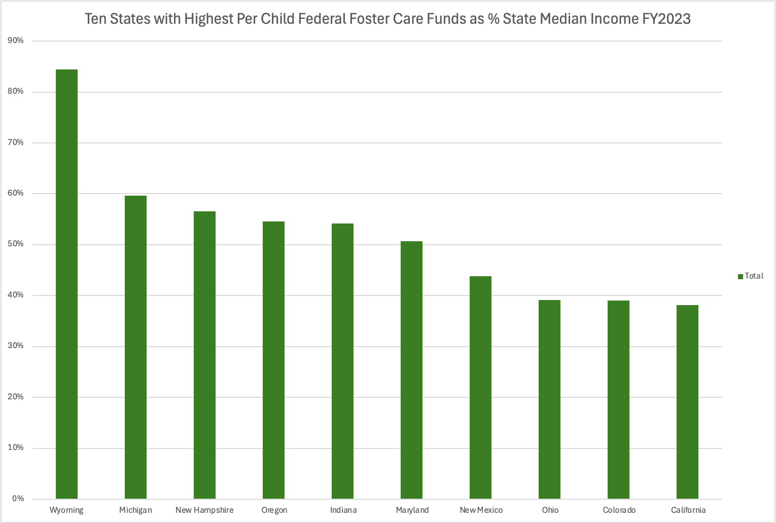
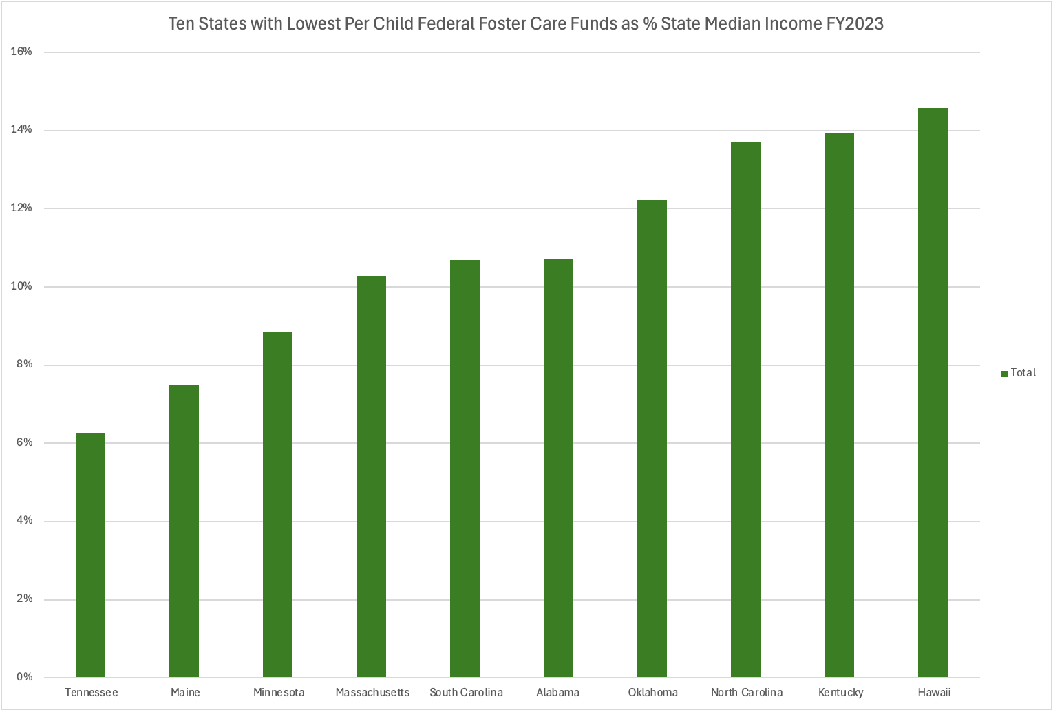
Adjusting Average Per-Child Federal Spending for Income
To control for variability across the country, these are per-child average claims, as a percentage of the state’s median income.7
We hope you enjoyed this wonktacular analysis, and look forward to bringing you more! What else do you need, wonks?
See page 13 from ChildTrends’s SFY 2020 survey
This analysis draws on Title IV-E expenditure data from the Children’s Bureau. And as always, the most recent data from the Form CB-496 (FY23 as of now) are a treasure trove of information.
Note for all of this analysis- the Children’s Bureau did not publicize data in FY2017, so we omitted it.
FFP is the federal share. So this tracks what the feds reimburse, not the total cost.
And before you come at me to argue that these are calendar years and fiscal years, stop. Yes wonks, I went through an re-averaged twenty years of monthly unemployment data for you, so that they match perfectly.
Which stem from the state’s Federal Medical Assistance Percentage (FMAP) rate, or administrative burden of eligibility determinations, or both…
FMAP is technically the reimbursement level for Medicaid, but often tied to other programs too. It ranges from 50 percent to 77 percent for states and Puerto Rico, and 83 percent for the U.S. Virgin Islands, Northern Mariana Islands, Guam, and American Samoa.
From the Census Bureau’s American Community Survey